Purpose
Linear regression methods are the workhorses of genotype–phenotype (G–P) mapping. Pairing one of the many available methods with a question is often difficult. Head-to-head evaluation of G–P model performance could help.
In this study, we evaluate a panel of linear G–P models on two contrasting genetic populations: yeast (F1 cross) and humans (chromosome 21 from the UK Biobank population). We use simulated phenotypes to benchmark the panel on phenotypic and variant-effect prediction tasks. We find that phenotypic and variant effect prediction often represent a tradeoff, of which population genetic structure is a key determinant.
This work is primarily aimed at researchers working on G–P mapping who want principled guidance on method selection, and at those developing more sophisticated methods who need a linear baseline to benchmark against.
Background and goals
How genotype maps to phenotype is central to understanding biology. It also has diverse applications — crop breeding, medicine, conservation — of which there are often two goals: 1) using genetic variation to predict phenotypes, and 2) identifying which variants drive this relationship. These goals are related but not equivalent, as some G–P models can be predictive but fail to recover causal effects. Others detect causal variants but explain global patterns poorly. Anticipating the trade-offs of a given model often requires extensive empirical evaluation or simulation (or both). Global benchmarks could be useful for resolving model strengths and weaknesses across the genetic continuum.
Biological subfields have developed their own intuitions and standards of practice when it comes to G–P mapping. For example, BLUP (best linear unbiased prediction) models are extensively used for plant and animal breeding applications. These models treat all individuals or markers (jointly) as random effects and fit them simultaneously with fixed effects (e.g., year of testing) 1–2. To do so, BLUP models impose a Gaussian prior on effect size distributions, making them a variant of regularized regression. While computationally costly, BLUP models are able to leverage the full genome to accurately predict breeding values and, as such, have transformed breeding. Other forms of regularized regression (e.g., Lasso, LARS, and elastic net), which impose sparsity-inducing priors, can also be applied to G–P data, although they're not as commonly used in the field 3–5 (but see de los Campos et al. 2012 6).
Human statistical geneticists have embraced genome-wide association studies (GWAS) to dissect the genetic basis of human traits 7. Unlike BLUP, GWAS tests variants one at a time (predominantly using single-marker mixed-effects models). These can include fixed (e.g., gender) and random (e.g., a relatedness matrix) effects as covariates in variant-phenotype association testing. GWAS is computationally cheap — especially for dense human datasets 8. It also has significant limitations. Testing millions of variants independently requires stringent significance thresholds to control false positives, causing many causal variants with small effects to go undetected 9. GWAS also lacks specificity as linkage disequilibrium (LD) can implicate an entire set of linked sites, requiring further work to disentangle the signal 10. Finally, GWAS effect-size estimation is plagued by inflation of variant effect estimates due to sampling noise, an issue that is curtailed in regularized regression models 11. Perhaps unsurprisingly, regularized joint models like those used in breeding can recover "missing heritability" that GWAS fails to capture, and significantly improve phenotype prediction in humans 9, 12–14. Despite such promising findings, researchers have devoted much less attention to variant identification/effect prediction using such models. This task is usually of low importance in breeding, since marker genotypes are effectively just a statistical proxy for local haplotype ancestry. Yet it is often the main goal of human statistical genetics studies.
One key determinant of model success in G–P mapping is population structure, including LD patterns, minor allele frequency distributions, and effective population sizes in the training data. For example, breeding populations — whether experimental crosses or selected livestock–tend to have large LD blocks and intermediate allele frequencies, a consequence of controlled mating designs and limited effective population sizes 11. In this regime, phenotypic prediction is aided by a smaller set of well-sampled common variants, but high LD makes accurate prediction of variant effects challenging. Natural human populations are nearly the opposite. LD blocks are smaller on average, minor allele frequencies are skewed toward rare variants, and population stratification introduces additional covariance structure between genotype and phenotype 15–16. In this regime, phenotypic prediction can be more challenging as signal is spread across many rare variants. On the other hand, lower LD may aid fine-mapping of variant effects, although population stratification can also introduce challenging confounding. How different regularized regression methods navigate these trade-offs — and whether the same method rankings hold across both regimes — is not well understood, particularly for variant effect prediction.
In this study, we compare a suite of linear regression methods across different trait architectures and population types, evaluating them for both phenotypic and variant effect prediction. We consider two different populations: 1) F1 individuals from a large yeast cross, and 2) human genomes (chromosome 21) from the UK Biobank, two datasets that mark different ends of population genetic structure. Using real genetic variation, we simulated phenotypes spanning a range of heritabilities, levels of epistasis, and numbers of causal variants. We compare both basic GWAS and different regularized regression methods across populations and traits. Finally, we implement and test an approximate ridge regression using stochastic gradient descent. This permits model training on much larger datasets, providing a practical test of whether scalable approximations to joint modeling retain the performance characteristics of their exact counterparts. Our results help guide researchers in making informed decisions on model choice that are based on dataset structure and G–P mapping research aims.
The approach
Data
Access the yeast genotype data (reformatted version of content originally from Nguyen Ba et al. 17) on Zenodo (DOI: 10.5281/zenodo.19860006).
To achieve realistic genetic structure in our training data, we simulated phenotypes on top of existing sequencing data in two real populations. The first population consists of 488,377 participants from the UK Biobank, and we limited our analysis to one chromosome (chromosome 21; 11,342 variants) as a proof of principle 18. The second population falls at the other extreme of genetic structure, consisting of 99,950 F1 segregants from a single yeast cross (41,594 variants across 16 chromosomes) 17. The two populations have different ploidy, population structure, allele frequency spectra, gene density, and countless other attributes — yet the overall dataset size is similar.
Phenotype simulation
Code, including phenotype generation, linear models, and analysis, is available in this GitHub repo (DOI: 10.5281/zenodo.19931628).
We simulated phenotypes spanning a range of architectures (Figure 1). We parameterize trait architecture using the ratio Vβi/VG — the proportion of genetic variance (VG) attributable to variance in additive effect sizes (Vβi) before averaging allelic substitution effects across allele frequencies — rather than the final VA/VG (i.e., the realized relative proportion of additive variance). This distinction matters because VA/VG depends on allele frequencies: epistatic variance is partially absorbed into additive variance when allele frequencies deviate from 50/50, as is the case in the human data 19. As a result, the realized VA/VG in our human simulations is substantially higher than the nominal Vβi/VG parameter, approaching ~1 even for traits simulated with Vβi/VG as low as 0.5. In yeast, due to balanced allele frequencies, Vβi/VG will closely track VA/VG. The Vβi/VG ratio therefore reflects our simulation input rather than the realized additive variance, and readers should bear this in mind when interpreting results across the two populations. We swept over Vβi/VG ratios (0.1, 0.2, 0.3, 0.4, 0.5, 0.6, 0.7, 0.8, 0.9, 0.98, and 1), numbers of causal loci (50, 100, 500, 1,000, 5,000, 10,000, and all variants), and broad-sense heritabilities (0.25, 0.5, 0.75, 0.99, 1). While we have made all 385 of them available, we show only a subset of 44 phenotypes per species in this project: all combinations of Vβi/VG = 0.5, 0.6, 0.7, 0.8, 0.9, 0.98, 1, and H2 = 0.25, 0.5, 0.75, plus one phenotype with Vβi/VG = 0.98 and H2 = 0.99. In humans, we used 50 or 100 QTLs, and in yeast, we used 100 or 500 QTLs (similar proportions of the numbers of SNPs in each dataset).
We used a {−1, 1} genotype encoding for the haploid yeast data and {−1, 0, 1} encoding for the diploid human data. For each phenotype, we first drew the specified number of variants at random from the data and assigned them additive effect sizes drawn from a Gaussian with mean 0 and standard deviation 1. If there was any epistatic variation (all Vβi/VG ratios except Vβi/VG = 1), variants with additive effects were randomly paired up to form epistatic pairs, each of which received an epistatic effect size drawn from a Gaussian with mean 0 and standard deviation 1. The epistatic effect size was then scaled by (1 − Vβi/VG) / (Vβi/VG) × 2 × ploidy to achieve the desired Vβi/VG.
We then calculated additive and epistatic contributions to the phenotype for each individual to get genetic values and breeding scores. We computed additive genetic scores by taking the matrix product of the centered genotype matrix and the vector of additive effect sizes. We calculated epistatic scores as the element-wise product of each SNP pair's centered genotypes, multiplied by the pair's epistatic effect size and summed across all pairs. We estimated average allelic substitution effects (alphas) for each epistatic SNP pair in order to calculate breeding values, then scaled the additive and epistatic effect sizes by the variance of the breeding scores to achieve an additive variance of 1. We lastly added environmental noise to achieve the desired broad-sense heritability.
Note that variants' allele frequencies or other properties had no influence on their likelihood of being chosen as causal for these phenotypes. Realistically, in “natural” populations such as UKBB we expect a negative relationship between variant effect size and minor allele frequency, an effect that we don't model for simplicity.
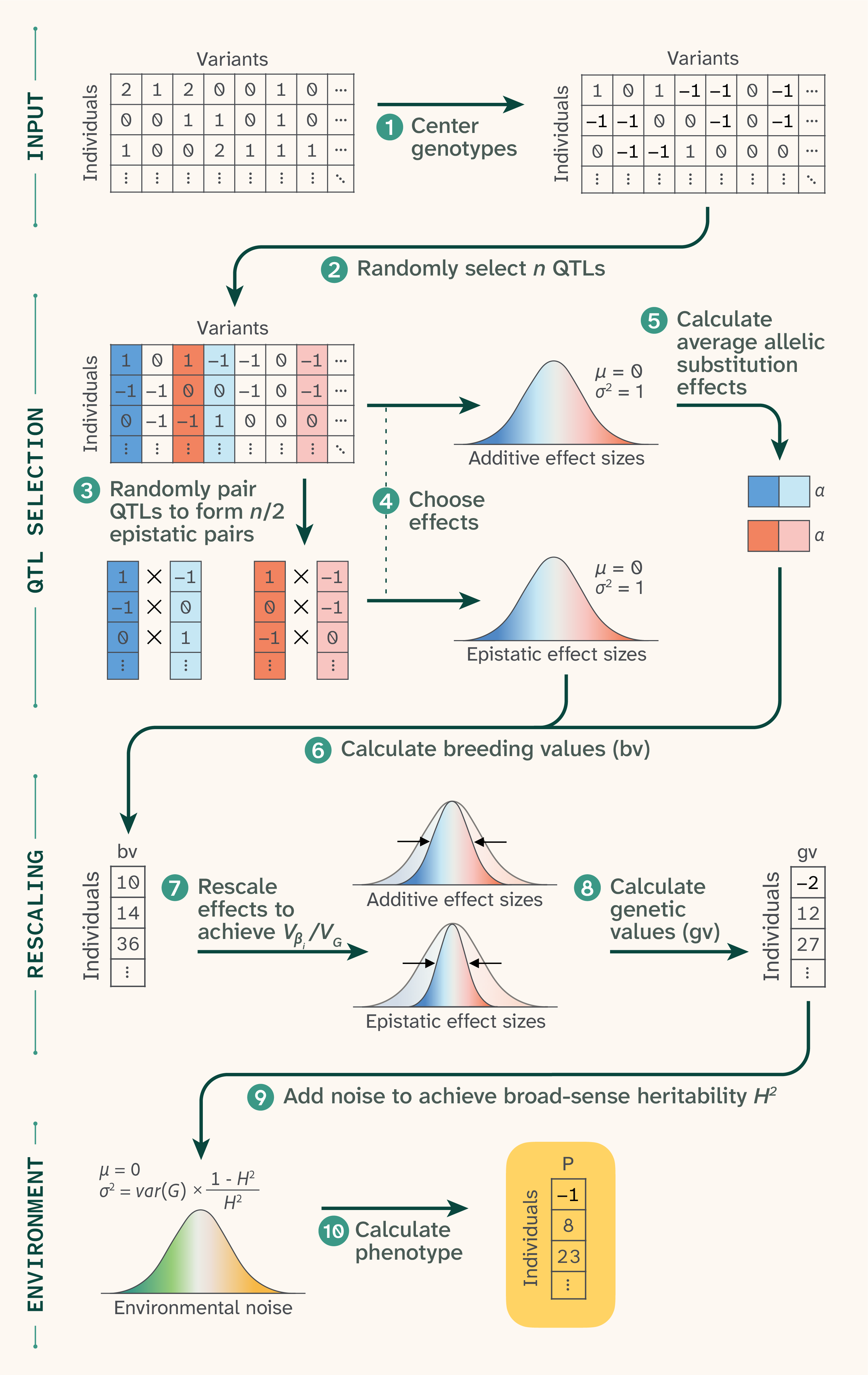
Figure 1. Phenotype generation.
(1) Genomic data was first re-coded as {−1,0,1} for diploid humans and {−1,1} for haploid yeast. For each phenotype, (2) n QTLs were randomly selected, then (3) randomly paired up to form n/2 epistatic pairs. (4) Each selected QTL received an additive effect and each epistatic pair received an epistatic effect, both drawn from Gaussian distributions with mean 0 and standard deviation 1. (5) Epistatic effects were used to calculate average allelic substitution effects, which were used along with additive effects to (6) calculate breeding values. (7) These values were used to rescale effect sizes to achieve a target Vβi/VG, and (8) rescaled effect sizes were matrix-multiplied by the input data to get genetic values. (9) Noise was drawn from another Gaussian distribution to achieve a target H2, and (10) the noise was added to the genetic values to achieve final phenotypic values.
Genomic prediction methods
Our first goal was to predict phenotype from genotype. We first divided each dataset into a “large” chunk (85% of the data; n = 415,120 for human, 84,958 for yeast) and a “small” chunk (15% of the data; n = 73,257 for human, 14,992 for yeast). Training on the large chunk was computationally intractable for many of the models, so we instead trained on the small chunk and used the large chunk as validation. Sample sizes are noted in all plots.
GWAS
We performed GWAS using PLINK 2.0 20, testing all variants. For humans, we included 0, 6, 10, 15, or 40 principal components pre-calculated by the UK Biobank as covariates to help account for population structure. Results using any (nonzero) number of covariates were qualitatively similar; we show the 6-covariate case for all plots. We did not include sex or age as covariates as these are not relevant to our phenotype generation process. For yeast, we did not include any covariates. GWAS is computationally tractable for both the large and small chunks of data, so we performed the same analysis using each, obtaining very similar results. All figures display results for GWAS using the large set (n = 415,120 for human, 84,958 for yeast).
We further processed the GWAS results by “clumping” variants using PLINK 2.0. This procedure selects index variants by p-value (p < 0.05/11,342 = 4.4 × 10⁻⁶ for humans and p < 0.05/41,594 = 1.2 × 10⁻⁶ for yeast), then groups variants within 250 kb and with an r2 greater than 0.5 with the index variant to be included in its clump. This process reduces some redundancy that results from testing each variant independently.
For the unclumped PLINK, we filtered SNPs by a multiple-testing-corrected significance threshold (p < 0.05/11,342 = 4.4 × 10⁻⁶ for humans and p < 0.05/41,594 = 1.2 × 10⁻⁶ for yeast).
Penalized regression
We tested four penalized regression approaches: ridge regression, the least absolute shrinkage and selection operator (Lasso), elastic net, and least angle regression (LARS). For all four methods, we first mean-centered the genotype matrices using allele frequencies estimated from the training set.
Ridge regression penalizes the sum of squared coefficients (L2 penalty), shrinking all SNP effects toward zero without performing variable selection. Although all SNPs remain in the final model, the ridge is likely to be advantageous over GWAS because it considers all SNPs simultaneously, reducing redundancy in the effect estimates of linked SNPs. The regularization parameter 𝛼 was selected by 5-fold cross-validation over a grid of 16 values spanning 10−3 to 107. We then refit the model on the training set using the optimal 𝛼.
Lasso (least absolute shrinkage and selection operator) penalizes the sum of absolute coefficients (L1 penalty), inducing sparsity by shrinking many SNP effects exactly to zero. Its variable selection ability could make Lasso advantageous over approaches like ridge regression for finding causal variants. The regularization parameter 𝛼 was selected by 5-fold cross-validation over a grid of 10 values spanning 10−7 to 102, and the model was refit at the optimal 𝛼.
Elastic net combines L1 and L2 penalties, interpolating between Lasso and ridge through an additional mixing parameter 𝜌, which represents the L1 ratio. This allows the model to benefit from the sparsity-inducing properties of Lasso while retaining some of the grouping behavior of ridge, which can be advantageous when causal variants are in linkage disequilibrium. Both 𝛼 and 𝜌 were selected jointly by 5-fold cross-validation, with 𝛼 searched over the same grid as Lasso and 𝜌 evaluated at values of 0.8, 0.9, 0.95, and 0.99. We again refit the model on the training set using the optimal 𝛼. Elastic net did not converge in yeast, so we do not present results for this method for that dataset.
LARS (least angle regression) fits a full regularization path by sequentially adding variables to the active set in order of their correlation with the current residual. Rather than searching over a predefined alpha grid, LarsCV determines the optimal stopping point along the regularization path via 5-fold cross-validation. We capped the number of steps at 1,000. Like Lasso, LARS produces sparse solutions and is closely related to it algorithmically; however, it traces the solution path in a single pass rather than solving a series of optimization problems. This makes LARS faster than Lasso, but it's known to struggle with correlated variants, which may make it less suited to this particular problem 21.
We implemented all four of these models using scikit-learn (1.8.0) 22.
Ridge regression approximation
As stated above, we used the small chunk (15%) of the data as the training set and the large chunk as the test set for the above methods due to computational limitations related to costly matrix multiplication. However, we also wanted to know whether we could approximate the solution to the ridge regression using a stochastically fit model, which could scale to much larger datasets (allowing us to train with the larger, 85% chunk).
To achieve this, we implemented a ridge regression model in PyTorch and trained it using the Adam optimizer with a ReduceLROnPlateau learning rate scheduler and early stopping (as described in our previous work 23). We searched two hyperparameters — regularization strength (𝛼) and the learning rate — over log-uniform distributions using the Optuna Bayesian optimization framework with a tree-structured Parzen estimator (TPE) sampler. We evaluated each trial using validation MSE, which served as the optimization objective, and used median-based pruning to terminate poorly performing trials early.
We conducted hyperparameter optimization on a representative set of phenotypes, then fit a simple linear regression model relating the optimal parameters to species, phenotype Vβi/VG ratio, and phenotype H2. We used this model to predict parameters for all phenotypes. We then refit the model for each phenotype using the best-fit hyperparameters (when available) and the predicted parameters otherwise.
ROC and distance analysis
ROC curves
Panels A and D of Figure 9 and Figure 10 show ROC curves for the identification of causal QTLs. We first ordered estimated coefficients by their absolute value (or by p-value for PLINK), then for each cutoff n, we counted the number of the top n SNPs that were true positives (have a nonzero additive effect and a nonzero coefficient estimate) or false positives (have a zero additive effect and a nonzero coefficient estimate). Note that this method does not take into account the estimate’s closeness to the true effect size. Elastic net, Lasso, LARS, and clumped PLINK are sparse methods, so their curves do not extend all the way from the bottom left corner to the top right.
Because SNPs are correlated with one another due to LD, it is common for linked non-causal SNPs to be weighted higher than causal QTLs. Thus, we also wanted to assess “approximate” matches–situations where a top-ranked SNP is physically close to a true QTL (Figure 9 and Figure 10, B and E of each). Similarly to above, we ranked estimated coefficients by their absolute value (or by p-value for PLINK). As we moved down the cutoff levels n, instead of only counting true positives/false positives among the 1st–nth SNPs, we considered windows of ± 250 bp around each of the 1st–nth SNPs and counted the total number of true positive/false positive SNPs in any of the windows.
Distance cumulative distribution functions
Even the least sophisticated G–P mapping methods are capable of identifying a wide region of association. However, linkage disequilibrium, population structure, and incomplete tagging of causal SNPs make it very difficult to pinpoint causal variants, even with additional fine-mapping steps. Thus, we wanted to assess the physical distance between top SNPs and causal QTLs for each of these methods (Figure 9 and Figure 10, C and F of each).
For each SNP with a nonzero estimated coefficient, we compute distances from this SNP to all true causal QTLs and select the nearest QTL as being tagged by this SNP. For each causal QTL, we then group together all SNPs tagging that QTL. We take the average physical distance between each SNP in that group and the true QTL. We then calculate the cumulative distribution over distances; in other words, for x from 0→1 × 10⁶ what proportion of true QTLs are located x base pairs or less from a tagged SNP/region.
Additional methods
We used arcadiathemeR (0.1.0) 24 to generate figures before manual adjustment. We used Claude (Opus 4.6 and Sonnet 4.6) to help write code, clean up code, comment our code, and review our code and selectively incorporated its feedback. We also used it to write text that we edited, expand on summary text that we provided and then edited the text it produced, suggest wording ideas and then chose which small phrases or sentence structure ideas to use, and help clarify and streamline text that we wrote.
The results
Phenotype prediction and variant effect estimation are both important in G–P mapping, yet models are often evaluated only at the phenotype prediction task. Therefore, we compared the performance of traditional GWAS and a set of regularized regression methods at phenotype and SNP effect size prediction across a suite of simulated phenotypes. Our approach aimed to compare the performance of regression methods capable of modeling the effects of all SNPs simultaneously across two datasets that span two extremes of population structure: a large yeast haploid F1 cross and chromosome 21 of the human genome from UKBB.
Phenotype and SNP effect size prediction in yeast
In yeast, Lasso, ridge regression, and approximate ridge all perform excellently at predicting the simulated phenotypes. As shown in Figure 3, A, all three methods have r2 values close to the theoretical maximum–the relative variance of additive genetic effects compared to the phenotypic variance (in this dataset, effectively, narrow-sense heritability). In contrast, PLINK (GWAS) consistently achieves r2 values of about half the theoretical maximum, while the clumped PLINK performs only slightly better. LARS performs the worst in this dataset. In Figure 3, B, results are grouped by broad-sense heritability for easier comparison. Note that we could not get elastic net to converge for the yeast data, so results for elastic net are only presented for human throughout this work.
While many of the methods excel at predicting individual phenotypes, they are able to do so without necessarily learning to predict true SNP effect sizes (Figure 3, C and D). This can be attributed to fairly strong local linkage disequilibrium (LD) in the yeast dataset, a consequence of limited recombination in an F1 cross (Figure 2). As a result, phenotypes can be predicted accurately using many different combinations of covarying SNPs, and effect sizes are often placed on the “wrong” SNP.
Expand for a supplementary figure on linkage disequilibrium patterns in yeast vs. humans.
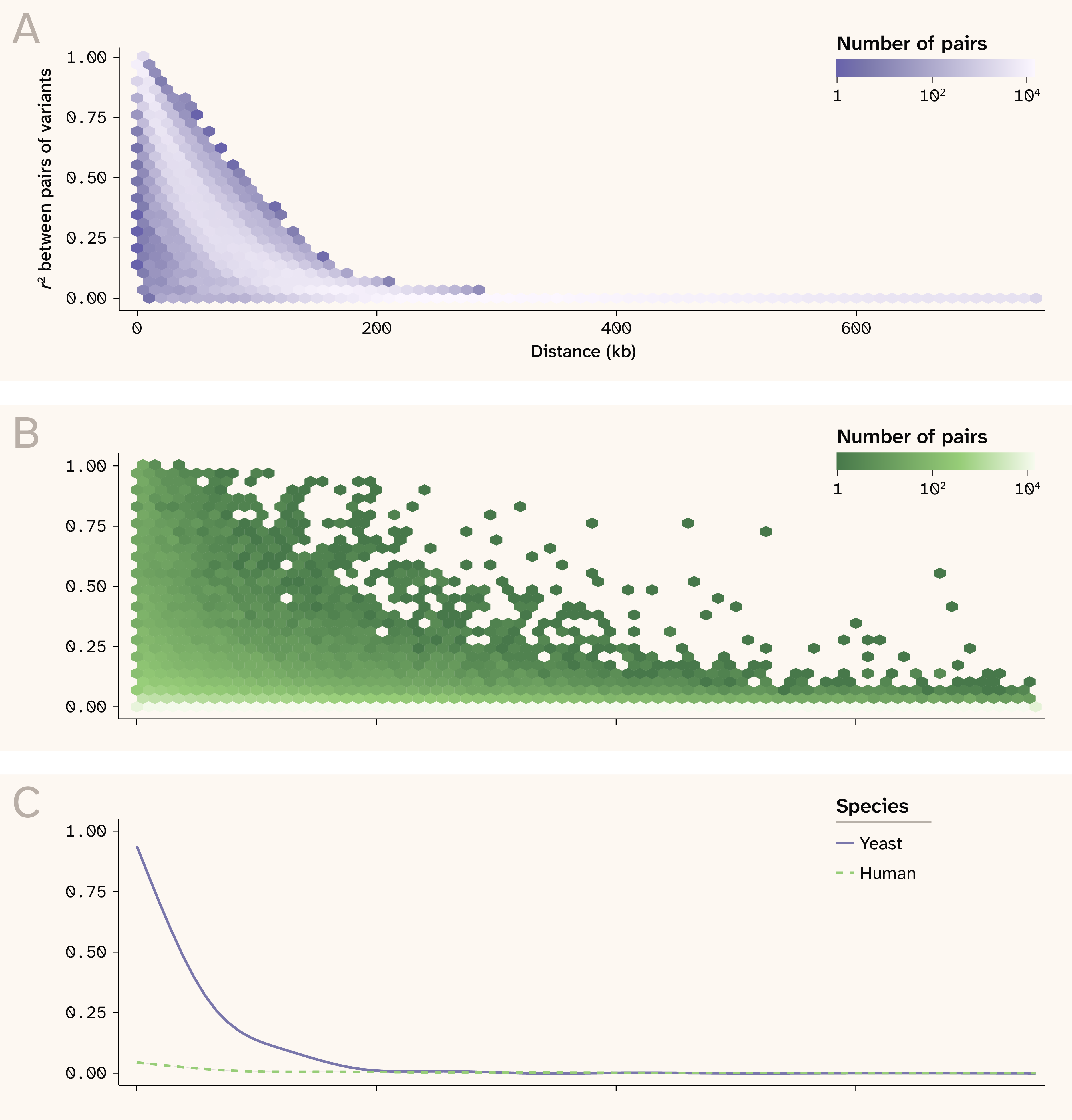
Figure 2. Linkage disequilibrium patterns in yeast and human.
(A) r2 between pairs of variants as a function of distance in yeast.
(B) r2 between pairs of variants as a function of distance in human.
(C) Smoothed relationship between r2 and distance for visualization purposes.
The Lasso is the only method that returns modest r2 values for some phenotypes. While LARS and Lasso are conceptually similar, LARS is more sensitive to highly correlated features, which could explain the large discrepancy between the ability of these two methods to predict effect sizes 21. Overall, it is promising that Lasso can perform reasonably well even in this highly confounded setting.
This yeast dataset clearly illustrates how poor variant effect prediction does not preclude excellent phenotypic prediction. However, large F1 crosses like this are not necessarily representative of “natural” populations which have more generations to break down large LD blocks and are not expected to suffer from this problem to nearly the same degree. To investigate this, we next looked at human population data from the UK Biobank.
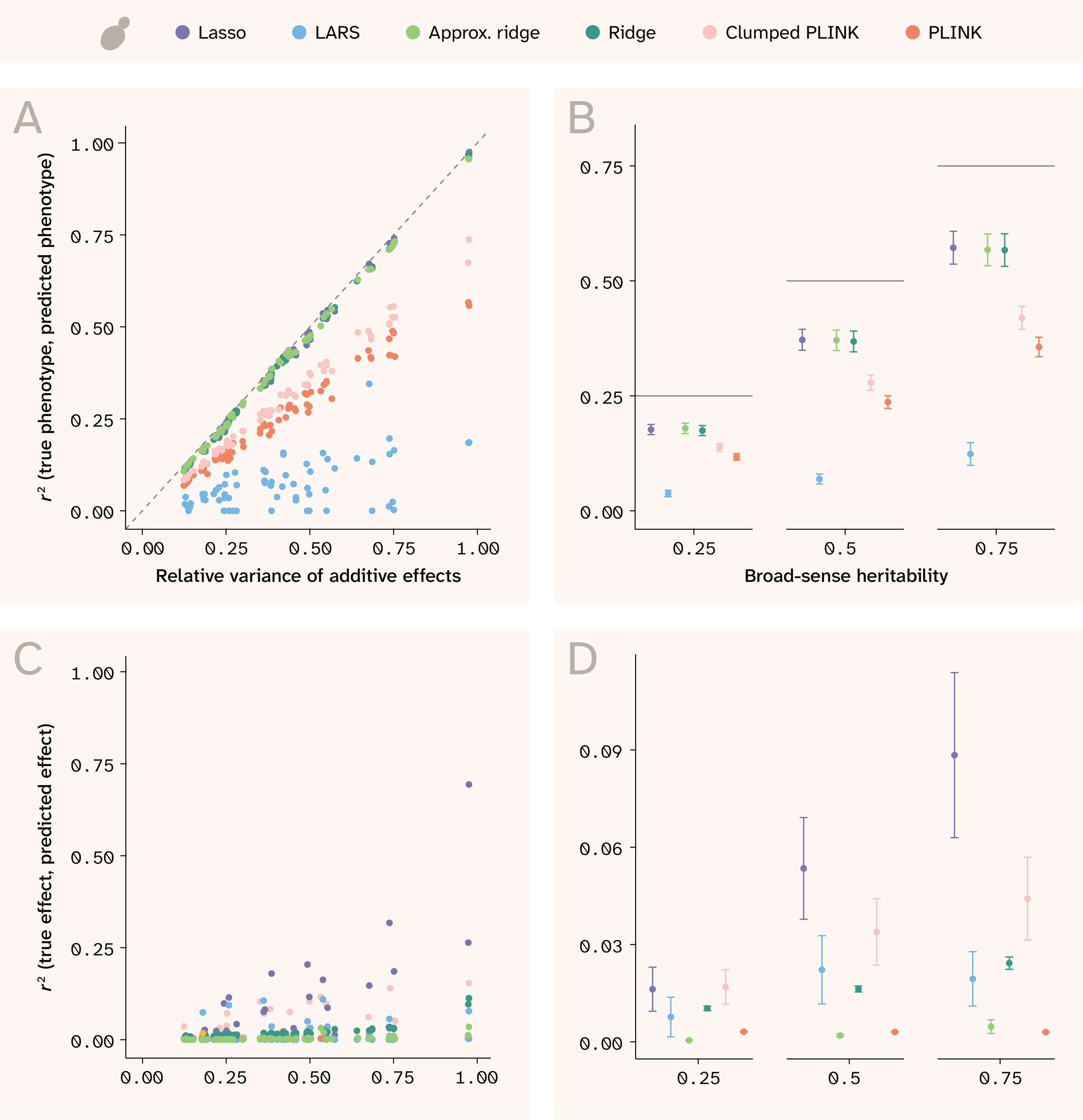
Figure 3. Phenotype and effect size prediction in yeast.
(A) r2 between true and predicted phenotypes for each trait against relative variance of additive effects.
(B) r2 between true and predicted phenotypes for each trait against broad-sense heritability. Horizontal lines indicate the maximum theoretical prediction accuracy.
(C) r2 between true and predicted effect sizes against relative variance of additive effects.
(D) r2 between true and predicted effect sizes against broad-sense heritability.
(B, D) Each point represents the mean among 14 traits and the bars indicate ± 1 standard error (SE).
We trained Lasso, LARS, and ridge using the small set (n = 14,992), and trained approximate ridge, Clumped PLINK, and PLINK using the large set (n = 84,958).
Phenotype and SNP effect size prediction in humans
In the human data, where local LD is weaker, we expected the models to achieve both good phenotypic prediction and to hone in on variants more precisely. For phenotypic prediction, we see that all models are often able to predict better than the relative variance of additive effects would suggest, as shown by the points in the upper triangle of Figure 4, A. This is because under non-50/50 allele frequencies, epistatic variance is absorbed into additive effects, inflating narrow-sense heritability beyond the relative variance of additive effects 19. Consequently, in the human data, the broad-sense heritability is a closer indication of the theoretical prediction maximum (Figure 4, B).
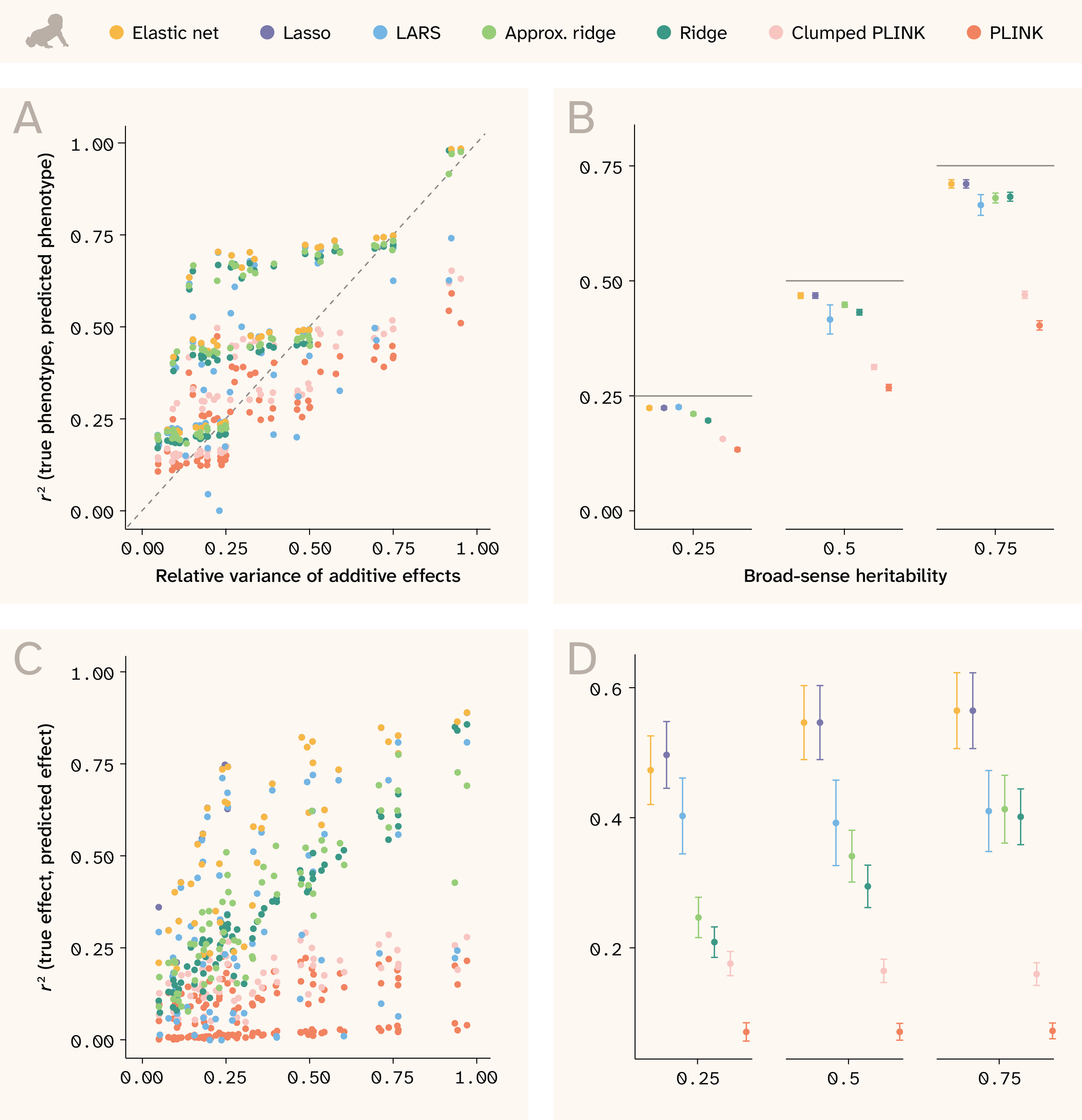
Figure 4. Phenotype and effect size prediction in human.
(A–B) r2 between true and predicted phenotypes for each trait against: (A) relative variance of additive effects or (B) broad-sense heritability.
(B) Horizontal lines indicate the maximum theoretical prediction accuracy.
(C–D) r2 between true and predicted effect sizes against: (C) relative variance of additive effects or (D) broad-sense heritability.
(B, D) Each point represents the mean among 14 traits and the bars indicate ± 1 standard error (SE).
We trained Lasso, LARS, and ridge using the small set (n = 73,257), and trained approximate ridge, Clumped PLINK, and PLINK using the large set (n = 415,120).
Sparse methods perform the best at phenotype prediction, with elastic net at the top, followed by Lasso and LARS. The ridge models are slightly worse, indicating that sparsity — not just simultaneous consideration of SNPs — is important to this task.
In stark contrast to the yeast data, the models perform much better at predicting variant effect sizes in human data (Figure 4, C and D). Although minor allele frequencies skew rarer in humans, neighboring SNPs are, on average, in weaker LD with each other (Figure 2). In this regime of LD, elastic net and Lasso perform well at selecting the correct features, while the ridge models — which perform fairly well at phenotype prediction — spread signal across correlated features and thus do not excel at this task.
As with yeast, PLINK performs the worst at predicting phenotypes and estimating effect sizes. Because the method tests each variant individually, it has no context for SNP effects and will inflate the effect sizes of SNPs correlated with the true effect. The simple post-hoc clumping procedure helps with this (as shown by its slightly better performance at both tasks; light pink vs. orange points), but PLINK still cannot achieve nearly the predictive ability of the other models. Researchers today often use PLINK to identify an associated large region quickly and easily, but identifying causal variants remains an issue with this method.
Confirming previous work, we found that the regularized regressions perform much better than traditional GWAS at phenotype prediction. We also evaluated models for variant effect prediction, finding that Lasso (and elastic net in humans) also perform very well at this task. However, as summary r2 values can't tell the whole story, we next examine specific phenotypes to understand why certain methods yield high (or low) effect-size r2 values.
Model differences in effect size estimation
Focusing on coefficient estimates for a representative trait allows us to build intuition about model behavior regarding learned phenotype genetic architecture. Even methods whose effect size r2 values are approximately equal might be “failing” in different ways. Conversely, they might have more power to recover effect sizes for particular genetic architectures. Here, we examine two traits: one with Vβi/VG = 0.9, 100 QTLs, and H2 = 0.25 (Figure 5, A and Figure 6, A, for yeast and human, respectively) and one with Vβi/VG = 0.98, 100 QTLs, and H2 = 0.5 (Figure 5, B and Figure 6, B). The second trait has less epistatic contribution and greater overall heritability, so effect sizes are expected to be easier to recover.
In both species, we see that the main issue with PLINK is that it assigns nonzero effects to many variants that lack a true effect (dense vertical line of points at a true effect of 0). Because it does not consider all variants simultaneously, it assigns weight to any SNP correlated with the true QTL — essentially highlighting an entire LD block. Conversely, the Lasso, LARS, and elastic net assign effect sizes of zero to several true effect QTLs (dense horizontal line of points at an estimated effect of 0), although they have better r2 values in general. By design, the L1 penalty used in these methods induces sparsity, allowing them to simultaneously estimate coefficients and perform feature selection (albeit without guaranteeing that the true input feature will be retained). Furthermore, the Lasso and elastic net solutions appear very similar; this is because the cross-validation used to train elastic net selected an optimal L1 ratio of 0.99, extremely close to the Lasso solution (L1 ratio = 1). This makes sense considering that the traits shown contain 100 QTLs/11,342 SNPs in humans, which translates to a very sparse 0.88% subset of predictive features. Interestingly, the LARS model is much sparser than Lasso in both species–too sparse–and as a result has a lower r2.
The ridge and approximate ridge models use the L2 penalty, which shrinks coefficients toward zero without performing feature selection. As a result, they generate more false positives, and in practice, researchers might have to rank coefficients by magnitude to prioritize them for downstream analysis. Both the Lasso and ridge regressions perform better on the human dataset (Figure 6) than on the yeast dataset (Figure 5); in yeast, highly correlated features lead the ridge to estimate nonzero effects for many noncausal SNPs and lead the Lasso to “choose” the wrong SNPs within each LD block (Figure 2).
In both datasets, we see that PLINK fails mainly because it assigns nonzero weight to all SNPs in a correlated group. In yeast, the ridge regressions also fail for this reason, while the sparse methods struggle to distinguish correlated causal from noncausal SNPs. Next, instead of looking at effect sizes in aggregate, we present an example genomic region to dig in further to what each method is actually doing near causal QTLs.
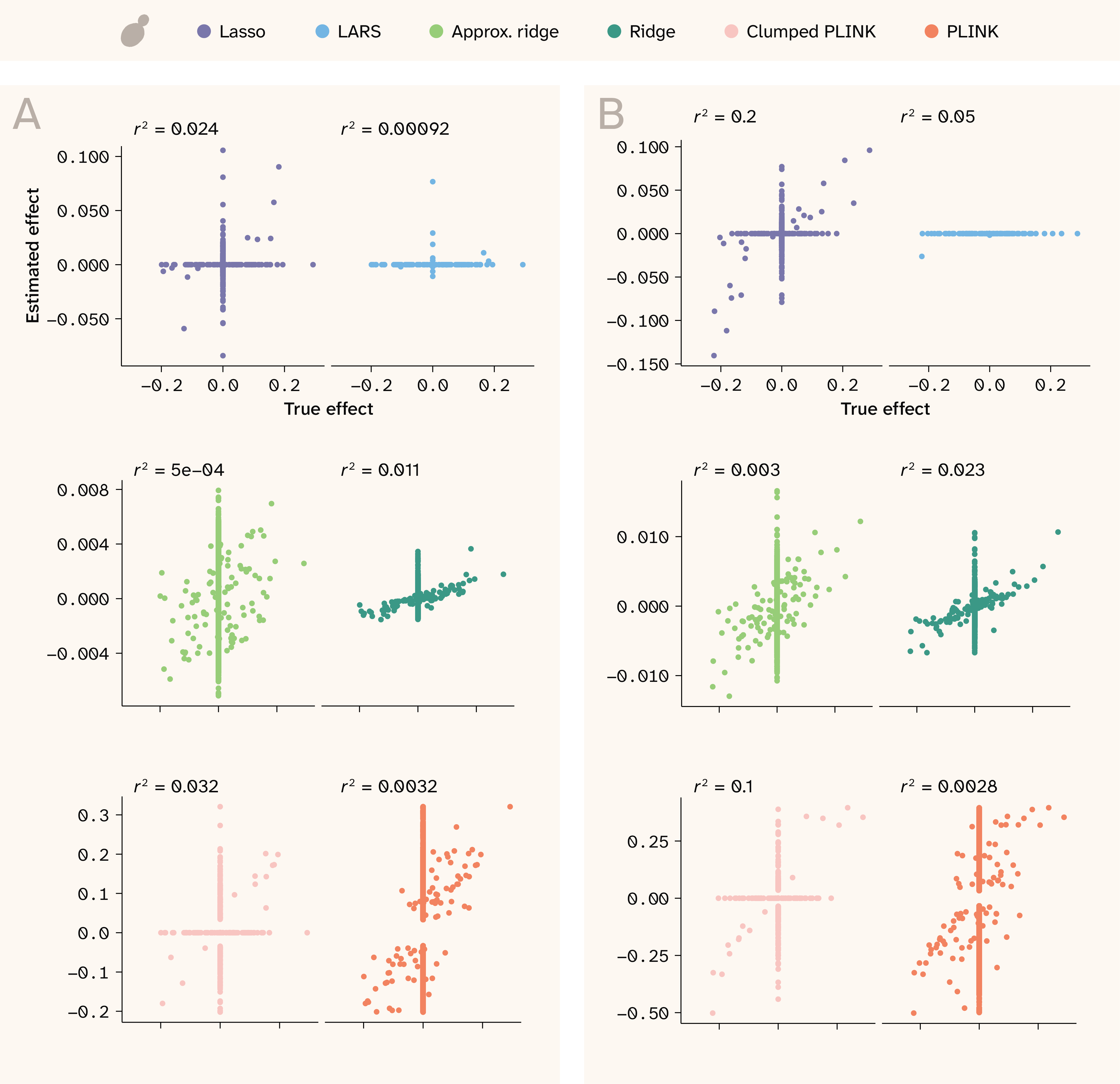
Figure 5. Effect size correlations for two realistic traits in yeast.
Estimated effects are shown on the y-axis, while true effects are shown on the x-axis. The two are expected to be correlated, but not necessarily to have a 1:1 relationship. r2 values are shown at the top of each plot.
(A) Trait with Vβi/VG = 0.9, 100 QTLs, and H2 = 0.25.
(B) Trait with Vβi/VG = 0.98, 100 QTLs, and H2 = 0.5.
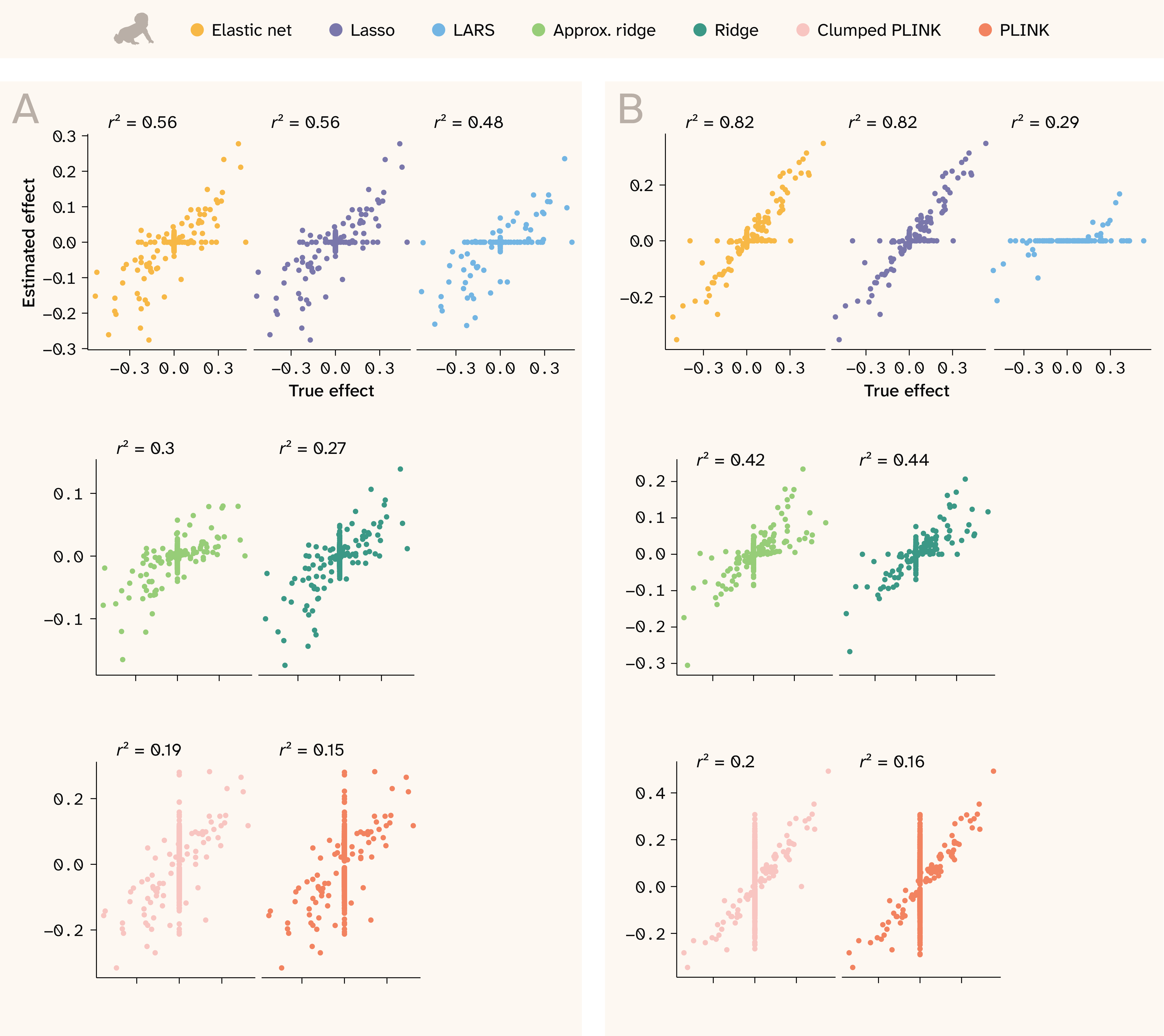
Figure 6. Effect size correlations for two realistic traits in human.
Estimated effects are shown on the y-axis, while true effects are shown on the x-axis. The two are expected to be correlated, but not necessarily to have a 1:1 relationship. r2 values are shown at the top of each plot.
(A) Trait with Vβi/VG = 0.9, 100 QTLs, and H2 = 0.25.
(B) Trait with Vβi/VG = 0.98, 100 QTLs, and H2 = 0.5.
Model performance in a local genomic region
Zooming in further to a focal genomic region, we can inspect in finer detail how models differ in the placement of estimated effects around regions with true QTLs. Figure 7 shows two regions of the yeast genome for the trait with Vβi/VG = 0.98, 100 QTLs, and H2 = 0.5, where true effects are plotted with stars and estimated effects are plotted with colored points. Estimates for each SNP that also has a true effect are shown in a darker color, with larger points if the estimate also happens to be nonzero. Coefficients and true effects were rescaled to a maximum absolute value of 1 for each panel for visualization purposes. As shown in the bottom panel, unclumped PLINK (orange) elevates the coefficients of all SNPs in a wide region surrounding the true QTLs. PLINK performs especially poorly in cases where true QTLs with opposite effects lie in close proximity. Instead of picking out individual SNPs, it tends to assign all-positive or all-negative coefficients to the entire region, likely contributing to poor phenotypic prediction. The clumped PLINK (pink) is much less redundant, although the selected index variants still implicate a wide region. Both ridge regressions pull out smaller regions of association and can detect nearby QTLs with opposite effects, but they are still very noisy. The Lasso regression assigns nonzero weights to only a few SNPs; while proximal to true effects, these SNPs are often not causal themselves. LARS struggled to assign weight to any of the SNPs for this trait.
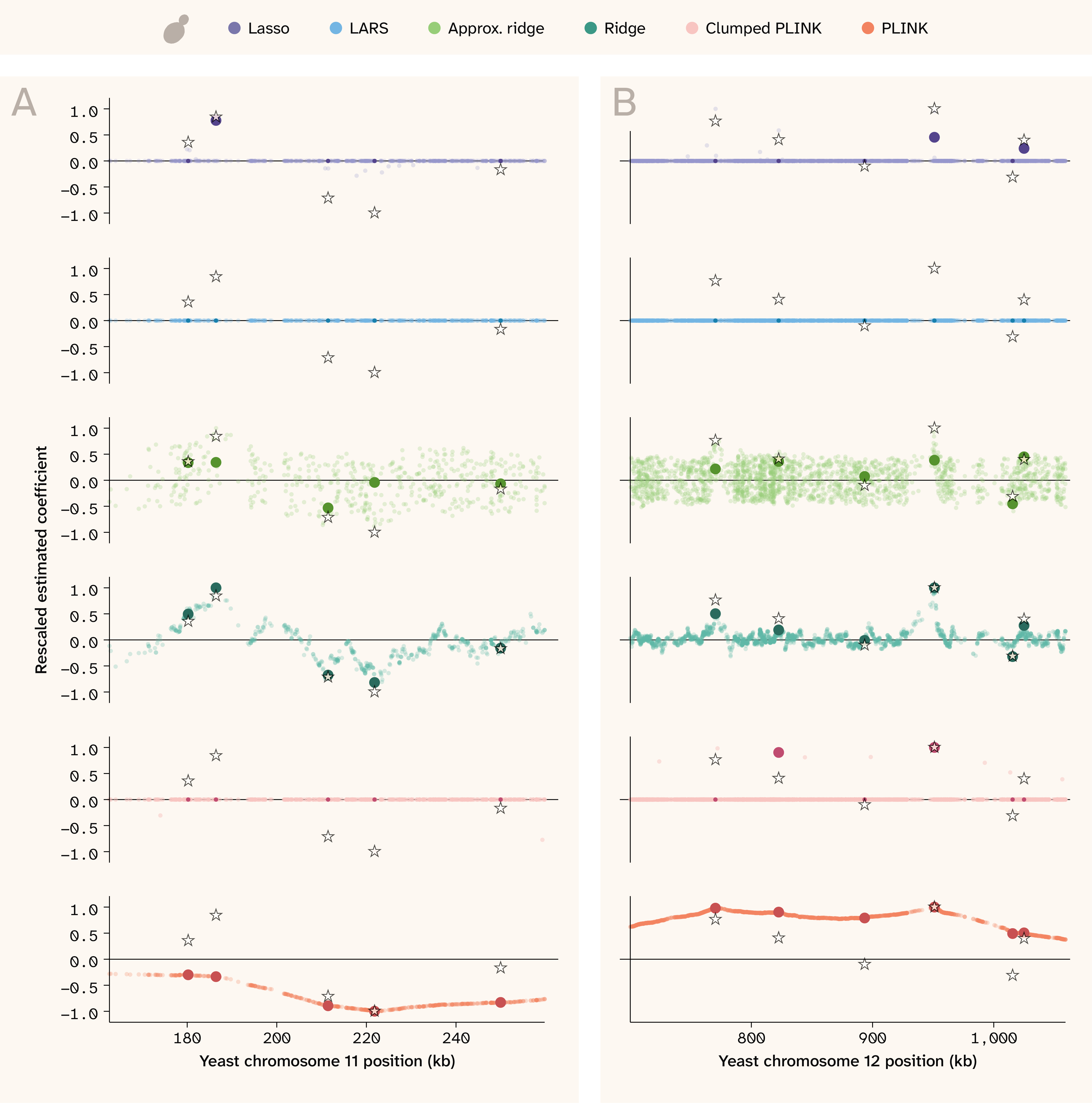
Figure 7. Effect sizes along the genome in yeast.
Genome position in kilobases (kb) is on the x-axis while scaled effect sizes are on the y-axis. The stars indicate the position and relative true effect size for causal QTLs, while the colored points indicate relative estimated effect sizes for all tested SNPs (for PLINK: significant SNPs). Both true and estimated effect sizes were rescaled to an absolute maximum of 1 for visualization purposes only. Darker/opaque points indicate estimated effect sizes for SNPs that are causal, and if they're nonzero, they're also larger in size. This helps visually distinguish estimates that “find” the truth and those that don't “find” the truth but are physically proximal. The trait shown has Vβi/VG = 0.98, 100 QTLs, and H2 = 0.5.
(A) 100 kb region on Chromosome 11.
(B) 360 kb region on Chromosome 12.
In the human data (Figure 8), the advantage of the regularized regression methods is especially clear. Elastic net, Lasso, ridge, and even LARS pull out true QTLs without false positives, even when causal loci are in close proximity and have opposite effects. Ridge regression (both implementations) performs better here than in the yeast, behaving much more like the sparse methods by assigning causal QTLs the largest coefficients. In contrast, significant PLINK hits are still scattered across the region (note that the smaller LD blocks and inclusion of covariates make the PLINK coefficients in human appear less smooth/continuous than in yeast). Although PLINK’s estimates for the true QTLs are largely accurate, there are many non-causal SNPs nearby with widely varying effect estimates. The clumped PLINK results look very similar to PLINK in the human setting because SNPs are less correlated with one another.
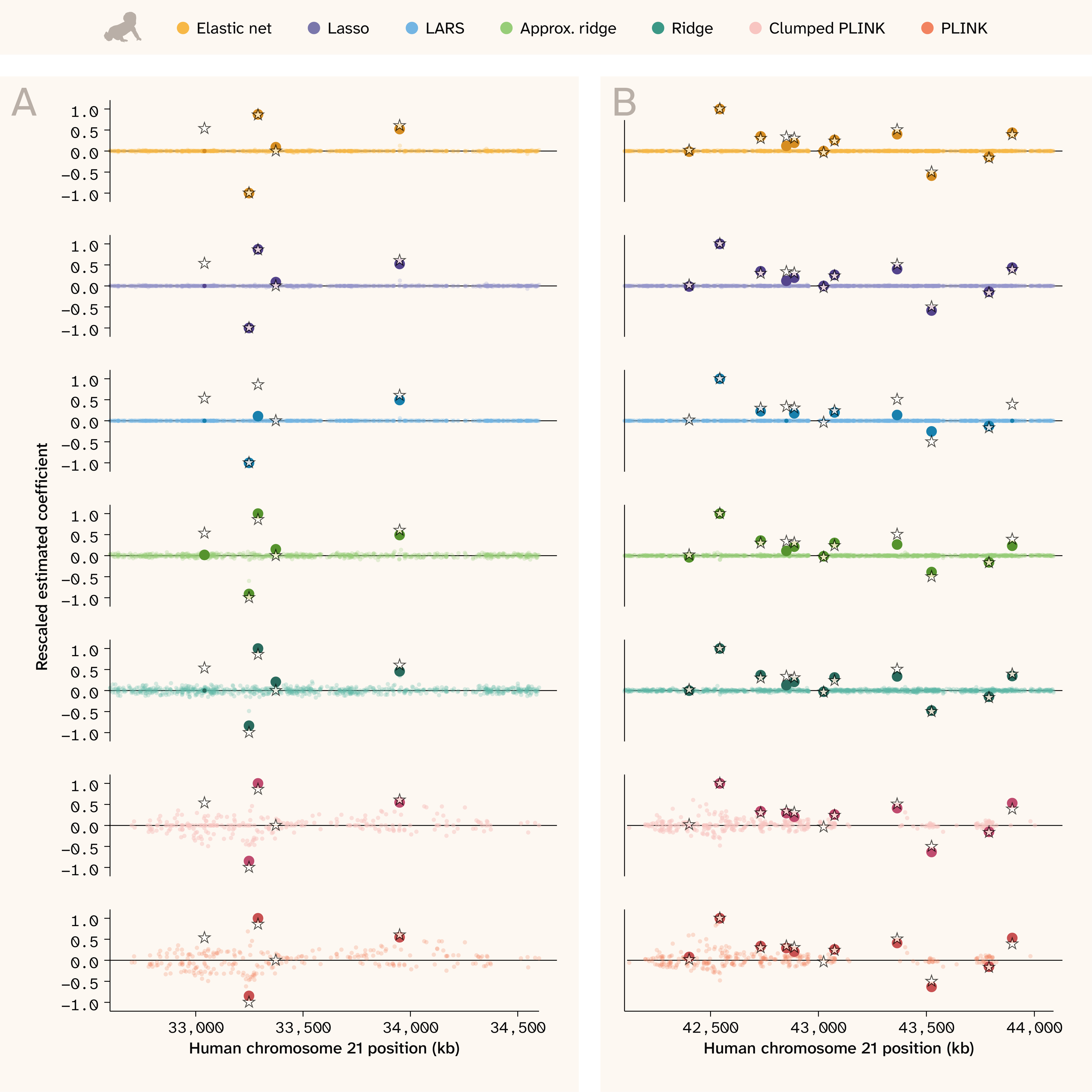
Figure 8. Effect sizes along the genome in human.
Genome position in kilobases (kb) is on the x-axis and scaled effect sizes are on the y-axis.
The stars indicate the position and relative true effect size for causal QTLs, while the colored points indicate relative estimated effect sizes for all tested SNPs (for PLINK: significant SNPs). We rescaled both true and estimated effect sizes to an absolute maximum of 1 for visualization purposes only. Darker/opaque points indicate estimated effect sizes for SNPs that are causal, and if they're nonzero, they're also larger in size. This helps visually distinguish estimates that “find” the truth and those that don't but are physically proximal.
The trait shown has Vβi/VG = 0.98, 50 QTLs, and H2 = 0.5. (A) and (B) each show a different 2,000 kb region.
Sensitivity and specificity
While regularized regression methods do not always select the true causal QTL in a region, they often select a nearby QTL while avoiding excessive numbers of false positives. To quantify this, we constructed receiver operating characteristic (ROC) curves and cumulative distance distributions, shown in Figure 9 for yeast and Figure 10 for human. Each shows results for the trait with Vβi/VG = 0.9, 100 QTLs, and H2 = 0.25 (Figure 9, A–C and Figure 10, A–C) and Vβi/VG = 0.98, 100 QTLs, and H2 = 0.5 (Figure 9, D–F and Figure 10, D–F).
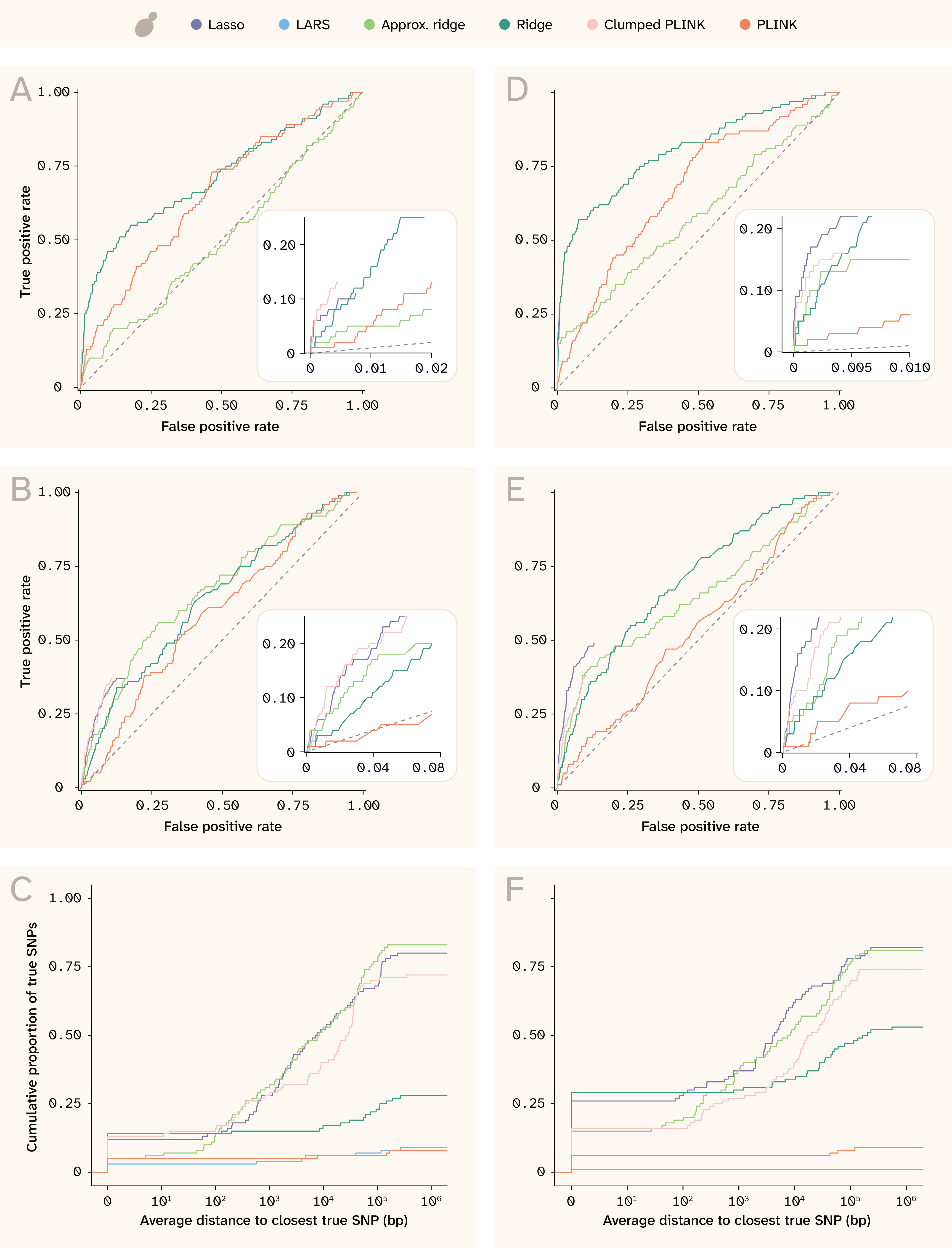
Figure 9. ROC curves and proximity distributions for recovery of true effects in yeast.
(A) ROC curves for exact SNP matching for the trait with Vβi/VG = 0.9, 100 QTLs, and H2 = 0.25. The numbers of true and false positives were calculated for each cutoff value n, where n means taking the top n SNPs ordered by absolute coefficient (or by p-value for PLINK). The inset panel highlights detail in the bottom left corner of the plot, especially for the sparse methods that assign nonzero coefficients to only a few SNPs (and whose curves thus do not extend to the upper right).
(B) Equivalent to (A) for the trait with Vβi/VG = 0.9, 100 QTLs, and H2 = 0.25, but for approximate SNP matching; the numbers of true and false positives were calculated from the union of ± 250 bp windows around each of the top n SNPs.
(C) Cumulative distribution of true SNPs found along different distances from index variants for the trait with Vβi/VG = 0.9, 100 QTLs, and H2 = 0.25 (more detail in methods).
(D–F) Same as (A–C) but for the trait with Vβi/VG = 0.98, 100 QTLs, and H2 = 0.5.
The left column of Figure 9 shows results in yeast for the trait with Vβi/VG = 0.9, 100 QTLs, and H2 = 0.25, while the right column is for the trait with Vβi/VG = 0.98, 100 QTLs, and H2 = 0.5. A and D show the ROC curves for recovering true effects exactly, while B and E show the ROC curves for recovering true effects within ± 250 bp of an implicated SNP. Because the ridge, approximate ridge, and unclumped PLINK report nonzero estimates for every SNP tested, these methods are the only ones whose curve extends all the way from bottom left to upper right. The inset panels provide more detail about the sparse methods; while these do not come close to identifying all of the causal QTLs, they are able to identify many with very few false positives. The clumped PLINK and Lasso perform better than the dense methods, but Lasso is better than clumped PLINK only for the more heritable trait. Note that these ROC curves do not consider effect size, only assignment of nonzero effects onto true QTLs. This is why Lasso and clumped PLINK appear to perform comparably, even though Lasso has better effect size correlations (Figure 5).
Panels C and F show distributions of distances to the nearest true effect QTL. For these, index variants were defined as the nonzero coefficients for elastic net, LARS, Lasso, and clumped PLINK. For the dense methods — PLINK, approximate ridge, and ridge — we defined index variants as the top 1% of SNPs (by p-value for PLINK and by absolute coefficient for the two ridge methods). We identified the nearest causal variant for each index variant as being “tagged” by that index variant. Causal variants could be tagged by none, one, or multiple index variants per method. Then, for each causal variant, we took the mean distance among index variants tagging that causal variant and plotted the cumulative distribution of causal variants tagged by distance. Note that many of the lines do not reach 1 on the y-axis; this means that many causal variants were not tagged by any index variant within 1 million base pairs.
We see that the approximate ridge, ridge, and Lasso have distributions skewed toward smaller distances in yeast (Figure 9, C and F), indicating that they are able to narrow down to smaller causal regions than the other methods.
The human results (Figure 10) are even more striking. Lasso and elastic net are able to find over 60% of causal variants at a 1% false positive rate for the less heritable trait (Figure 10, A), and nearly 75% of causal variants at a 1% false positive rate for the more heritable trait (Figure 10, D). Both ridge regression variants, which run considerably faster than these methods, perform the next best, achieving extremely high sensitivity values. LARS selects far fewer variants than the other sparse methods, so despite an initial performance comparable to the ridge regressions, it simply fails to detect most of the causal QTLs. The PLINK methods are unmistakably the worst for the human dataset, although the clumping procedure does improve specificity. Note that this plot does not consider if effect sizes are correlated or even have the same sign, which would further decrease the apparent performance of PLINK (see Figure 6).
The distance plots for human (Figure 10, C and F) also demonstrate the high specificity for most methods. Most top SNPs are causal QTLs, as shown by the lines starting high up on the y-axis at a distance of 0 and then remaining constant until at least 1,000 bp. Lasso and elastic net not only “find” the largest number of causal QTLs, but they also find all of the QTLs to within 5,000 bp in the less heritable trait (Figure 10, C) and nearly all within 5,000 bp in the more heritable trait (Figure 10, F). Clumped PLINK also performs well using this metric, mostly because it selects more variants than the other sparse methods. Interestingly, LARS performs worse on the more heritable trait (Figure 10, F) than the less heritable one (Figure 10, C), possibly because its solution is less stable 21; testing more replicate phenotypes of the same architecture could shed light on this.
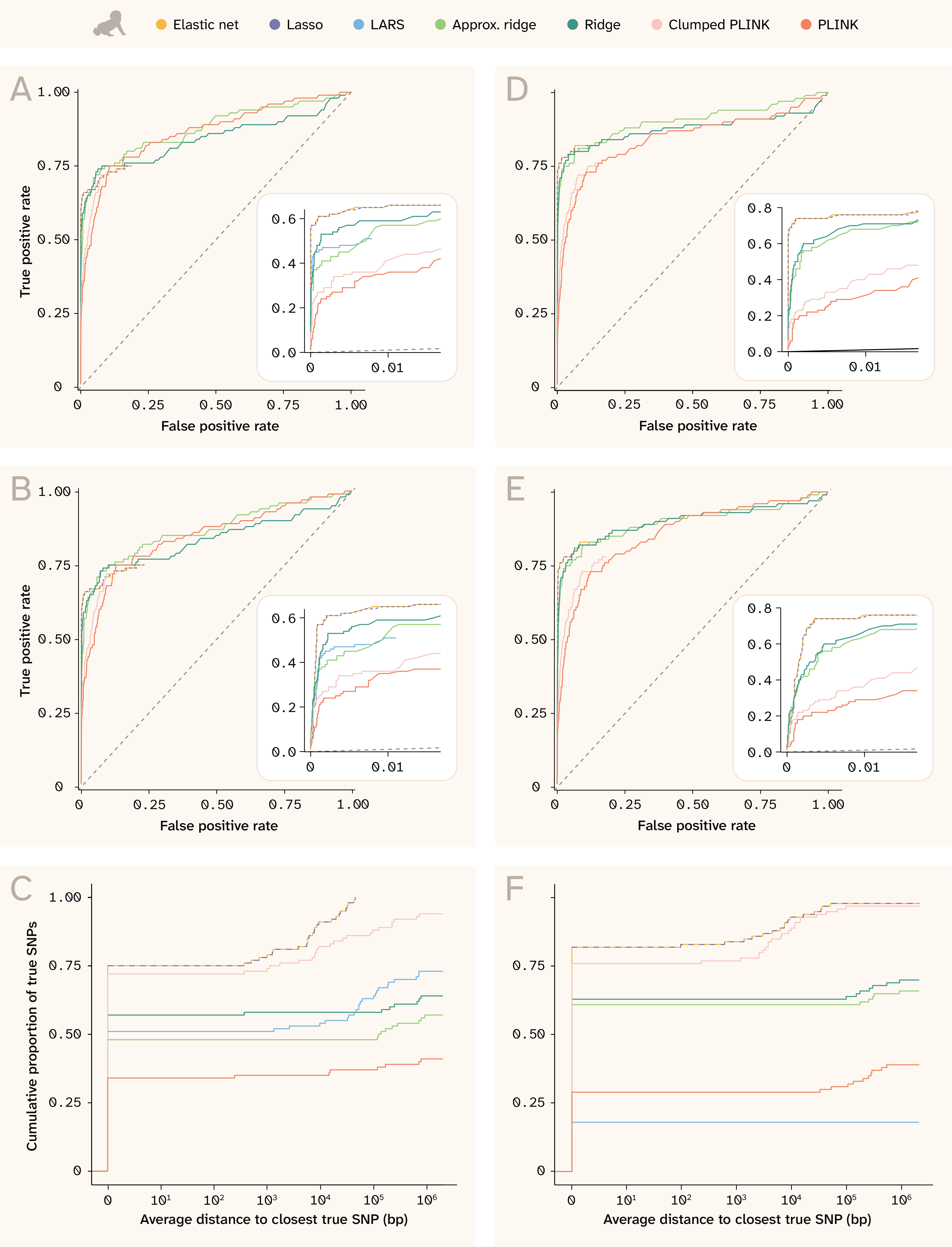
Figure 10. ROC curves and proximity distributions for recovery of true effects in human.
(A) ROC curves for exact SNP matching for the trait with Vβi/VG = 0.9, 100 QTLs, and H2 = 0.25. The numbers of true and false positives were calculated for each cutoff value n, where n means taking the top n SNPs ordered by absolute coefficient (or by p-value for PLINK). The inset panel highlights detail in the bottom left corner of the plot, especially for the sparse methods that assign nonzero coefficients to only a few SNPs (and whose curves thus do not extend to the upper right).
(B) Equivalent to (A) for the trait with Vβi/VG = 0.9, 100 QTLs, and H2 = 0.25, but for approximate SNP matching; the numbers of true and false positives were calculated from the union of ± 250 bp windows around each of the top n SNPs.
(C) Cumulative distribution of true SNPs found along different distances from index variants for the trait with Vβi/VG = 0.9, 100 QTLs, and H2 = 0.25 (more detail in methods).
(D–F) Same as (A–C) but for the trait with Vβi/VG = 0.98, 100 QTLs, and H2 = 0.5.
In this figure, Lasso is also dashed for better visibility of elastic net, which has a very similar solution.
Dependence on trait architecture
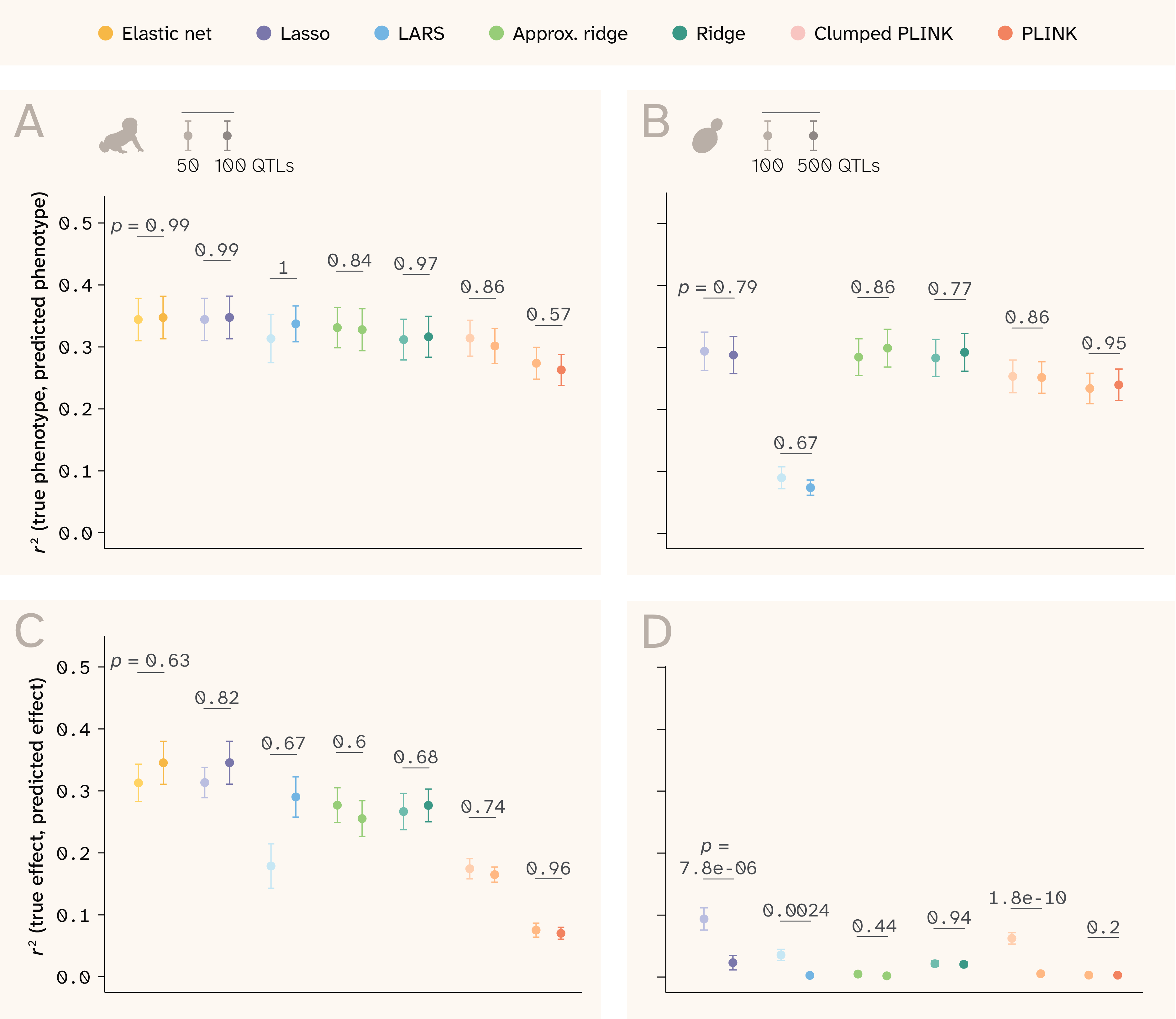
Figure 11. Additional genetic architecture parameters that affect prediction ability.
(A–B) r2 between true and predicted phenotypes by method in (A) human and (B) yeast.
(C–D) r2 between true and predicted effects by method in (C) human and (D) yeast.
In all panels, the lighter point/bar is for phenotypes with fewer QTLs, and the darker point/bar is for phenotypes with more QTLs. p-values are for the Wilcoxon rank-sum test comparing the distribution of R² values for traits with different numbers of QTLs.
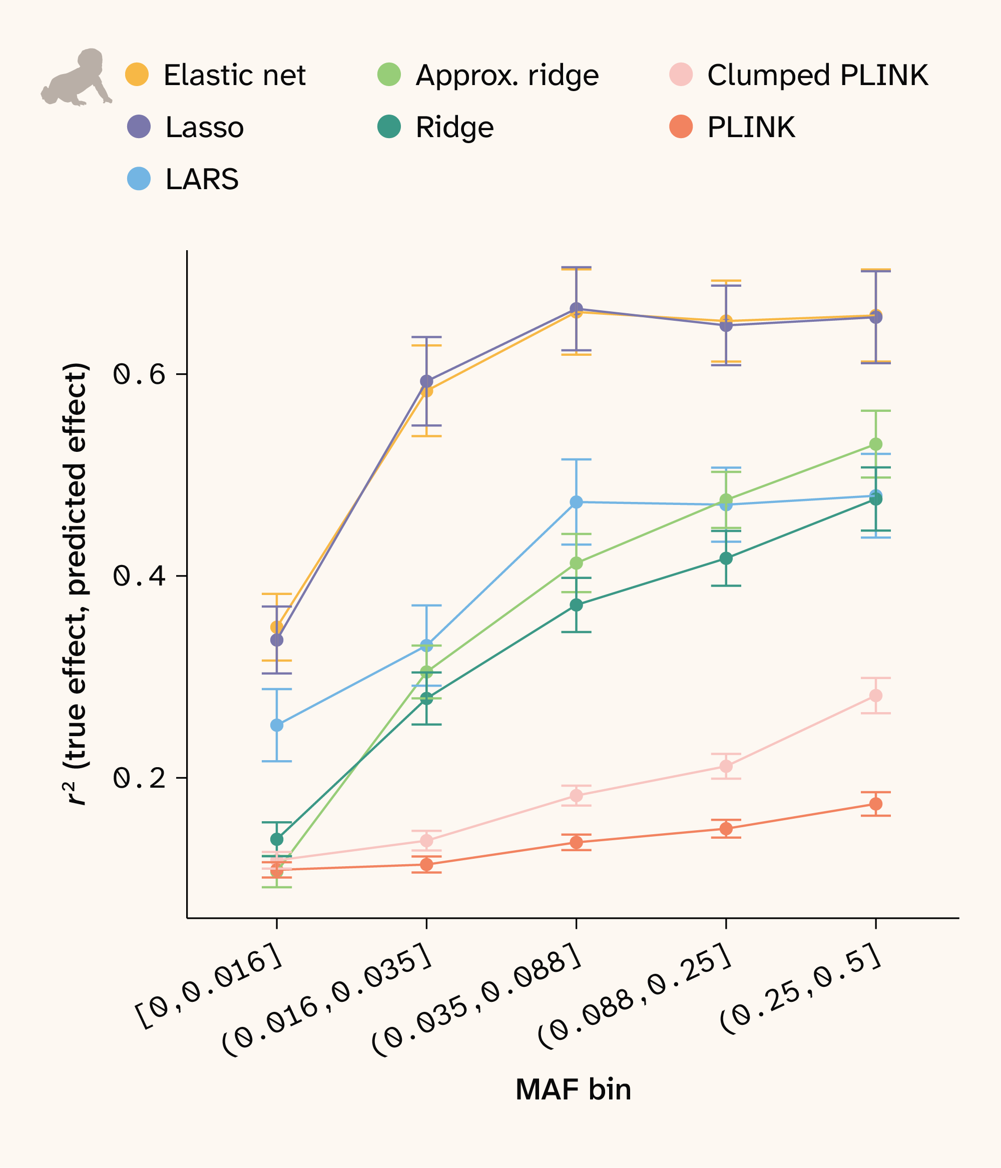
Figure 12. Effect size recovery by MAF in human.
SNPs were assigned to bins such that each bin has an approximately equal number of SNPs. Correlations between true and estimated effect sizes were then calculated for each bin and method. Points show the mean for all traits and bars depict ± 1 SE.
In both datasets, the models’ performance depends strongly on trait architecture. The ability to predict phenotype is determined mainly by broad-sense heritability (VG/VG+E) (Figure 3, B and Figure 4, B) and to a lesser extent the relative variance of additive effects (Vβi/VG), which explains the variance in traits with the same broad-sense heritability in Figure 3, B and Figure 4, B. Conversely, the models’ ability to predict effect sizes depends more on Vβi/VG than on broad-sense heritability (Figure 3, D and Figure 4, D). Interestingly, the number of QTLs underlying the trait does not affect phenotype r2 or effect size r2 in human, yet it does impact effect size r2 in yeast (Figure 11). For this dataset, the sparse methods (Lasso, LARS, clumped PLINK) perform better with fewer true QTLs, while the dense methods are unaffected. This again relates to the different genetic structure present in the two datasets. Yeast LD blocks are larger, so correlated QTLs are harder to distinguish — a problem exacerbated by denser QTL placement (Figure 2).
Additionally, r2 for both phenotype and effect prediction depends on allele frequency. We expect all methods to have less power to estimate effect sizes at lower minor allele frequencies (MAF), and we indeed observe this relationship for all methods in human (Figure 12). Notably, elastic net and Lasso more accurately recover effect sizes across all MAF bins. Since the yeast data has near 50/50 allele frequencies for all loci, this analysis does not apply to that dataset.
Key takeaways
Genotype–phenotype mapping has two distinct goals: predicting trait values from genetic data and identifying which specific variants drive trait variation. Methods optimized for one don't necessarily perform well at the other. We benchmark GWAS (single variant) and a suite of regularized regression methods (joint modeling of all variants) across a wide range of simulated trait architectures, evaluating performance at both tasks. To span contrasting extremes of population genetic structure, we simulate phenotypes on real genotype data from a large F1 yeast cross — characterized by large LD blocks and near-50/50 allele frequencies — and from the UK Biobank population — which has weaker local LD and a skewed allele frequency spectrum typical of a natural outbred human population.
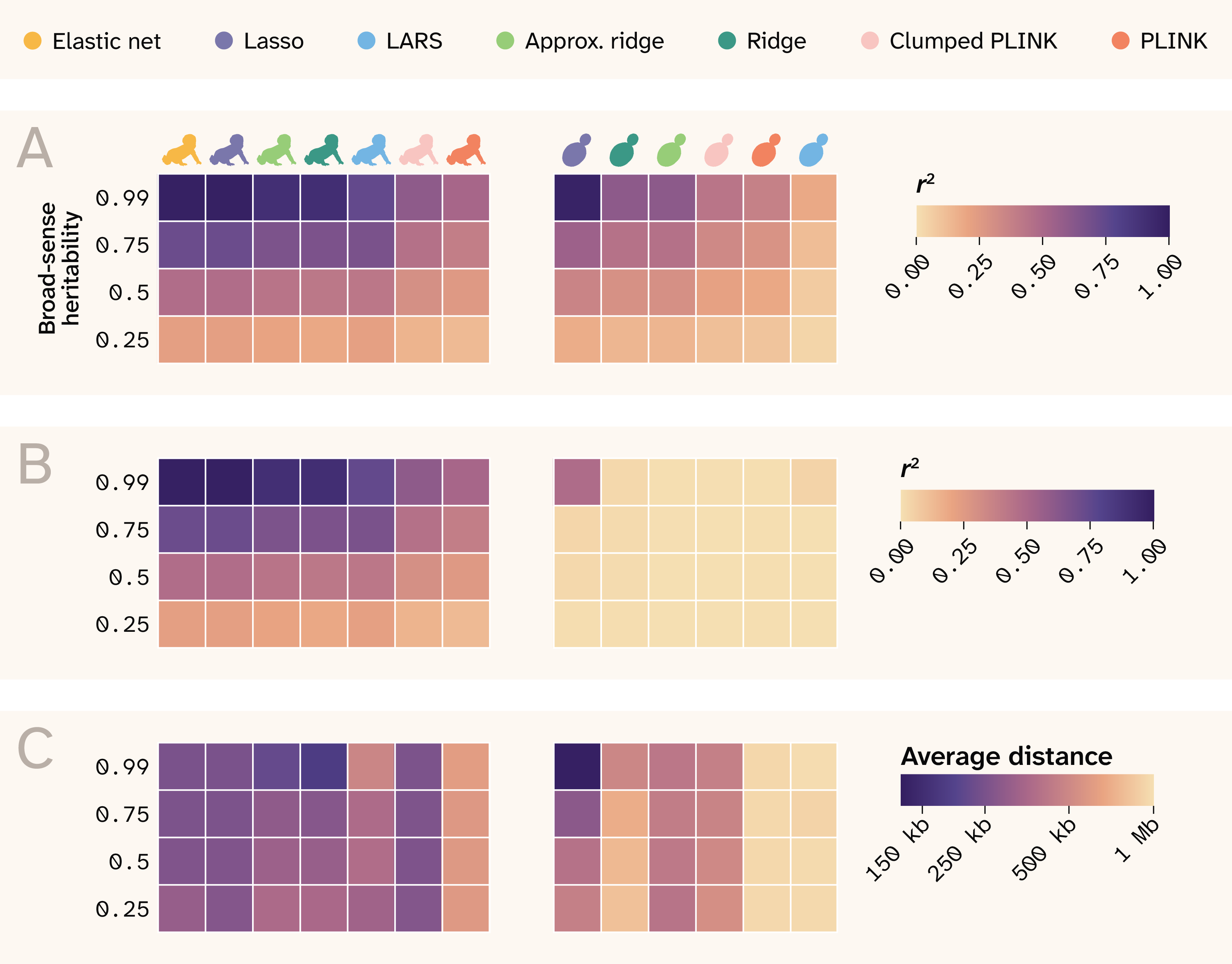
Figure 13. Summary of results.
The rows indicate different broad-sense heritability values, and each column is a different method, separated by human and yeast and labeled by color at the top of the plot. Note that the order is rearranged from previous plots for better visual continuity.
(A) r2 between true and predicted phenotypes.
(B) r2 between true and predicted effect sizes.
(C) Average distance between causal QTLs and top SNPs that map to them.
Regularized joint modeling methods substantially outperform GWAS at phenotype prediction across all conditions (Figure 13), with Lasso, ridge, and elastic net all approaching the theoretical maximum predictive accuracy in both yeast and human data. Sparse methods (Lasso, elastic net) outperform dense methods (ridge) at variant identification, particularly in human data, where weaker LD allows these methods to localize signal to causal loci rather than spreading it across correlated haplotype blocks. Prediction and variant identification come apart most severely in high-LD populations, where all methods predict well, but only Lasso achieves modest effect-size recovery. GWAS performs poorly at both tasks relative to joint methods, systematically inflating effect sizes of non-causal variants in LD with true QTLs and failing to reach the predictive accuracy of regularized regression even after clumping. ROC curve analysis confirms that sparse methods achieve better true positive rates at low false positive rates in both populations, with Lasso and elastic net identifying causal variants in proximity to true QTLs more reliably than GWAS even when exact causal SNP recovery is limited by LD. In the human data, effect size recovery declines with decreasing minor allele frequency across all methods, though elastic net and Lasso show a consistent advantage over other approaches at all variant frequencies.
Researchers should not assume that a method that predicts well is also identifying the right variants, and method choice should be guided by both the specific goal and the population genetic context of the system under study.
Next steps
Our work here represents a starting point for further fine-scale dissection of G–P mapping approaches. Future efforts in this line of inquiry could extend comparisons to a larger suite of models (including those not based on linear regression), to a broader set of even more realistically simulated phenotypes, and finally to datasets sampling more axes of population structure.
Multiple extensions are possible for testing a larger suite of G–P models. For example, there have been many improvements to traditional GWAS since PLINK, although PLINK is still widely used. In the future, it would be valuable to include more sophisticated GWAS methods such as BOLT-LMM, GEMMA, or REGENIE in the benchmark 8, 25, as well as combining GWAS with dedicated downstream methods such as SuSIE, FINEMAP or PRS-CS 10, 26–27. Our analysis has demonstrated that regularized regression is superior to traditional GWAS, yet the computational cost of such models — particularly sparse ones — is high. In our work here, we implemented a simple stochastic approximation to ridge regression, which alleviates the cost of model fitting. Our framework should, in theory, be extensible to other forms of regularization, such as L1 (mimicking Lasso) or other hybrid L1/L2 forms, such as Hadamard loss, which could allow for computationally efficient feature selection in larger datasets. Extensions to Lasso also exist, such as plasso, which has been shown to improve variable selection performance in biological data 28, or blockLASSO, which is a computationally cheaper approximation to a global Lasso model 29. Finally, we could test combined strategies, such as performing initial feature selection through cheap GWAS followed by more computationally expensive methods. This could be particularly fruitful for applying nonlinear methods such as deep learning to G–P mapping tasks.
Future work would also benefit from more realistic individual phenotypes. For example, stabilizing selection could be added to induce a more realistic inverse relationship between MAF and effect size. Strong directional selection could be applied to simulate large LD blocks around trait-associated variants. For human data, phenotypes could be assigned nonrandomly (e.g., correlated with environmental features or geographic clines) to better reflect realistic population structure. While we designed these phenotypes to be uncorrelated, phenotypes in real populations often share genetic bases, another simulation aspect we could model. Methods that can treat measured phenotypes as expressions of simpler latent phenotypes can, in theory, uncover more about them through their shared features and would also be valuable to benchmarking.
We considered two populations at opposite ends of the genetic architecture spectrum. In reality, genetic architecture is continuous, and it would be interesting to survey the performance of these methods across that spectrum. For example, populations derived from plant and animal breeding programs would be more similar to the yeast F1 cross, but with greater selection influence. Some natural populations of animals and plants likely engage in more random mating than humans, resulting in less population structure. And among humans, different populations have very different LD patterns — a known problem when trying to translate the results of G–P mapping efforts across human populations 30–31. Note also that our study was limited to chromosome 21 as a proof of principle, and as such, we don't capture genome-wide population structure. Benchmarking across a range of simulated or real population architectures would provide further insight to model performance under different conditions.
Acknowledgements
Acknowledgements
This research has been conducted using the UK Biobank Resource under Application Number 103445.